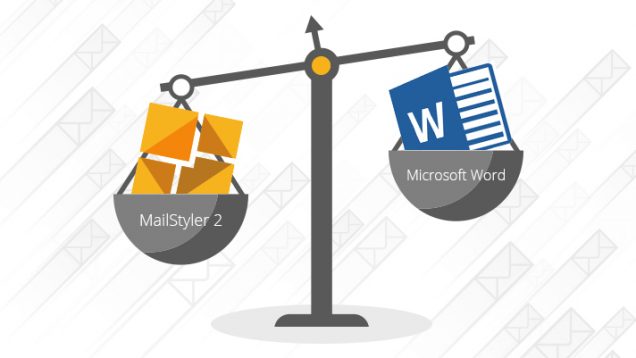
We all have that friend or colleague who, having to send us an image on Skype or by email, launches Word, open a new document, adds the image, saves and shares it with us. We all have been annoyed by this kind of things, right? Apply the same concept to newsletters: there are people who prepare their newsletter layouts with Microsoft Word instead of professional tools like MailStyler.
Our grandparents already knew the truth: for every job to do there is the right instrument. Just as Word is great for writing long, structured, formatted documents, so MailStyler has been designed and developed to do one thing for you: templates for newsletters.
An email is nothing more than HTML code. Just as a browser will have difficulty reading a page of code poorly written, or with lines that are not consistent with each other, so your email client will have a hard time displaying correctly a template generated with imperfect code, full of unnecessary parts or even harmful to your ultimate goal.
The problem is that to show you a practical and beautiful layout, Word injects into the code parts that are not needed and that are not read correctly by the HTML engines of email clients or browsers. The only thing you’ll get after a few hours of hard work on Word, looking for the perfect design, is that your recipients won’t see what you’ve prepared for them, but a botched version of it.
Incorrect formatting, twisted spaces, out-of-alignment images: these are just some of the results you can expect from using a massive and redundant word processor like Microsoft Word. A professional time builder generates HTML code instead as correct as possible: templates created with MailStyler, for example, are correctly displayed on all email software, regardless of the device used. This is why we strongly suggest that you use Word for what it does best, i. e. to write texts and format them for printing, and keep creating your newsletters with MailStyler 2.


