The most compelling and up-to-date tips about email creation and design, to craft an amazing newsletter template.
The art of newsletter making needs a constant injection of good ideas to produce fresh, innovative results that can beat the email fatigue and entice the recipients’ attention.
Think only about the amount of emails that an average corporate user has to handle per day: more than 100. (And we’re not counting all the personal and marketing messages…) In this scenario, it can get very hard to make someone read your content or perform the intended actions.
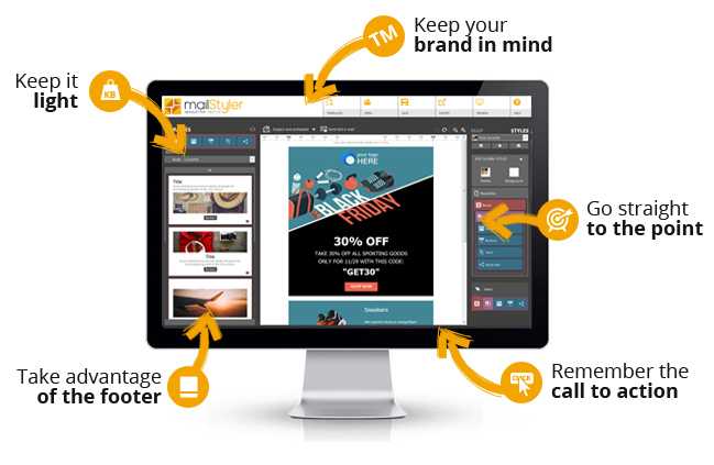
That is why we have collected five newsletter ideas to help you craft the best message for your needs. MailStyler will take care of the rest, giving you a WYSIWYG email editor to build amazing layouts with only a few drag-and-drop moves.
- Start with what’s worth. As we have said before, the clock for email reading ticks very fast — actually, the vast majority of users mostly skim newsletters instead of actually read them. So: preambles are banned. Cut straight to the chase and start with what’s really worth your users’ attention: your offer, your news, anything you propose. The content must be concise and pregnant at the same time.
- Use lightweight images (and always provide an alternative text). Your newsletter should never be more than 70Kb, to guarantee that it will be correctly delivered. If you’re uploading images, then, make it sure that they’re both light and good-looking (a huge help here is a professional image optimizer like the one provided by Adobe Fireworks). Also, remember to put an alternative text for all pics in case of image-blocking, and find the right balance between graphics and text.
- Re-read. Not only to find out typos and mistakes (especially the terrible ones like a wrong offer), but also to verify the quality of your content and its length. Always re-read a newsletter before sending it. Always.
- Put extra attention on the subject. Believe it or not, people still receive emails with generic or uninformative subject lines like “Newsletter n. 43” or “Offer for you”. You can and must do much better if you want your recipients to open and read your message. Some suggestions: keep it brief (under 50 characters); use pipes (|) to divide the information; avoid useless details and try to evoke rather than describe the content of your email; and never (never) use caps.
- Write perfect HTML. This is crucial, as only a clean HTML code can ensure a good readability of your newsletter on any clients and webmails (helping its deliverability as well). If you don’t have technical knowledge and you’re not able to code, no worries: MailStyler will take care of all that, providing you pre-designed HTML blocks that need only to be assembled as you wish.
DOWNLOAD DEMOBUY MAILSTYLER PRO
Latest release: 2.24.01.17 | Release date: 17/01/2024 | Size: 114.9 MB
License agreement | How to uninstall


