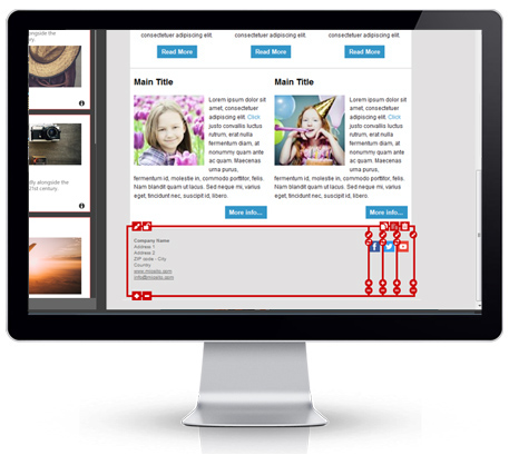
An email signature is a very logical way to end a newsletter, just like a paper letter: with your details.
If it’s just a personal or one-to-one message, it’s best just to include your name, company name and position, your phone number and a link to your website. If on the contrary we’re talking of a newsletter or a commercial/mass email, things may change a bit: generally there will be no name or surname, but maybe some links to social networking sites or other ways to keep in touch.
From a structural point of view, email signatures go naturally in the footer — that is, the part at the very bottom of the global layout. That’s why it’s so important to design it properly when it comes to create your newsletter template.
Especially, you should never use an image as signature: either because it can affect badly the deliverability of your message, and because it may not be displayed in case of image blocking (a default option in many mail clients).
So — like it’s usual in all good email design — some HTML is essential here. But if you’re a beginner or do not know anything about code, no worries: with MailStyler, crafting an email signature will be a cakewalk.
You simply need to drag and drop a module from the “Footer” category and add it at the bottom of your template. That’s it, done: now you just need to add your content. And about that, here are just some general, commonsense rules:
- Don’t go overboard
This happens especially in personal email signatures, when you find loads of supposedly funny quotes or animated GIFs and other terrible stuff, but unluckily some newsletters share the same problem. There’s no need at all to stuff your email signature with generic or even unprofessional content: limit yourself to what’s needed for your communication, and keep it as concise as possible. - Pay attention to the local rules
Some countries require companies to put in any communications some information like the VAT number of the address; check carefully your country’s one. - Add an unsubscribe link
Generally the footer is the perfect place where to put an unsubscribe link to your mailing. Not only this is often required by law: it’s also a huge help for the people who are no more interested in your emails — and for your deliverability. As a matter of fact, simplifying their unsubscribe process means that you will reduce considerably any spam complaint. - If you’re including a logo, keep it light
MailStyler allows you to produce an email signature with an image: just make it sure that this is very light. This will help the email delivery flow. - Check the links
A very general advice, but it’s always worth repeating. Double-check all the links you put in the signature to verify they’re not broken!
DOWNLOAD DEMOBUY MAILSTYLER PRO
Latest release: 2.24.01.17 | Release date: 17/01/2024 | Size: 114.9 MB
License agreement | How to uninstall


