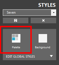
The palette button enables you to access the palette window through which you can change the palette for the entire style in one click.
| The palette button |
|
| Click to enlarge |
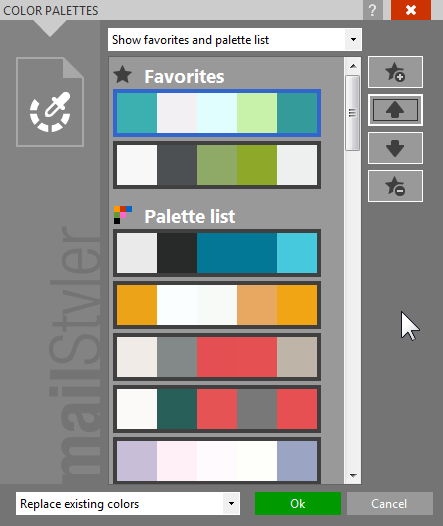
The palette window shows a list of pre-constructed palettes that you can apply to your newsletter.
Each palette has been designed balancing each color combination so that the final effect will always favor readability and graphic impact.
| The palette window |
|
| Click to enlarge |
You can create and manage a Favorite list of palettes through the buttons along the right side of the list.
The top combo box enables you to selectively display all palettes, only favorite palettes or only palettes not in the favorite list.
The Favorite management is only available for custom-made styles (styles that have been customized and saved with a name). For factory styles, the Suggested view is displayed instead, showing a list of possible alternative pallets compatible with the style in use.
Finally, the lower combo box enables you to decide if you want to apply the selected palette to the current contents and all blocks added later, or skip the current current contents and just save it for future uses.
When you drag a new block to the newsletter, certain elements may not necessarily inherit the palette color the style is using at that particular time. This is due to the fact that some elements were designed with hard-coded colors that override the style color, in order to ensure a certain effect. For example, some elements have hard-coded transparencies that are needed regardless of the palette in use. You can still manually change any element and once you apply your own color to an element, it will lose all hard-coded information and will be subject to all future style changes like all other elements.
Once a palette has been selected, it will be used by MailStyler in several different ways.
First, as mentioned before, it will be applied to the current contents and/or to all future blocks added to the newsletter.
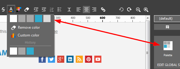
Then it will affect all controls used to define a color. Each control will show palette colors on top (suggested choice) even if you will still be able to define your own color, see image below.
| Color selection |
|
| Click to enlarge |
The image above shows the color selection control used to define text color.
As you see the first row shows palette colors, but you can still define your own custom color by clicking Custom color.
The lower part of the control shows a list of up to 10 most recent used colors, regardless of whether they were chosen from the palette or defined as custom colors.
See also
Cell style
Font style
Image style
Button style
Saving styles
Deleting styles

