MailStyler's Block library contains 2 categories of blocks:
Standard blocks and Responsive blocks.
Standard blocks are designed to be used on newsletters that will be generally displayed on PC computer screens, while Responsive blocks are best suited for portable devices, such as tablets and smartphones.
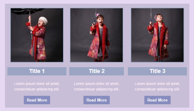
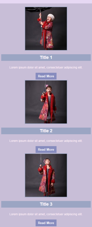
Responsive blocks automatically rearrange their contents vertically when the width of the viewing device is smaller then 600 pixels.
| A responsive block when viewed on a display larger than 600 pixels | The same responsive block when viewed on a display smaller than 600 pixels |

|

|
| Click to enlarge | |
Mixing blocks from the 2 categories in one newsletter is strongly discouraged.
This is due to the fact that non-Responsive blocks viewed on a portable device will make your newsletter hard to read.
Use the proper blocks from a single category, depending on the type of system your newsletter is targeting.
When not sure, use Responsive blocks.
See also
The block panel


