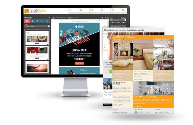
Building a beautiful and effective newsletter template is essential when it comes to nurture the digital relationship with your customers. Unfortunately, creating a proper newsletter template from scratch can be very challenging, especially if you strive — as you should — to get both a quality design and a perfect readability on any device (which requires a thorough knowledge of HTML/CSS).
That’s why many beginners — and many expert marketers as well — have not a clue about where to begin.
Luckily, now there’s an easy way to build your newsletters in seconds without even writing a line of code: MailStyler.
Using our WYSIWYG editor you can compose email layouts simply dragging and dropping pre-made blocks: your newsletter will be built step by step and you’ll be able to edit, change it and correct it in real time (also adding and cropping images, positioning buttons and text boxes etc).
Moreover, as all basic elements have been crafted by professional web designers, your newsletter will result to be a perfect HTML email that will look great on any device — smartphones and tablet included.
And here are some hints to help you build a truly effective newsletter:
- Be relevant.
Sure, this may sound very generic, but many marketers still take their users’ interest for granted. On the contrary, subscribing to a newsletter implies tacitly that all communications received will be somehow related to one’s expectations. This doesn’t simply mean that if you sell shoes you’re going to send promotions or news about shoes and not cakes: it also means that your content must be always enticing, original and compelling. Sounds hard? It is, but it’s also the only way to cope with your competitors. - Always provide an unsubscribe link.
Give your readers the chance to unsubscribe quickly and safely — in one click only — is necessary to comply the law, and is also a widely recognized best practice. If you think that this will make you lose customers, you’re wrong: on the contrary, it will drastically reduce all spam complaints coming from users who don’t know how to opt out. MailStyler provides some devoted footer blocks where to put this particular link. - Find a good balance between text and images.
One of the most common mistakes when it comes to create a newsletter it’s to fill it up with images (worst if heavyweight ones). This can harm the deliverability of your message — that is, its capacity to correctly get to the users’ inboxes — and its readability as well. In particular, you should never assume that your images are displayed, as many clients have an image blocking option activated by default.
So your key content should always be in plain text, while images should catch the reader’s attention or evoke better what’s offered. MailStyler’s pre-made blocks are a huge help from this point of view, because they’re built to guarantee the best balance between graphics and text. - Think multi-device.
A large part of your users will probably open your message on a smartphone or a tablet. That’s why you should keep your content succinct to make it enjoyable also on smaller screens; this concerns especially the length of your email. Though using MailStyler you can craft potentially endless newsletters, it’s very advisable to make it as short as possible. The best suggestion to adjust the length, however, is the following… - Make tests before sending.
MailStyler frees you once for all from the necessity to test your email on different clients: being its elements crafted in perfect HTML, its readability is assured on any device.
Still, it’s very important to run a test before the actual sending to check if the newsletter you’ve composed really works for your needs. Once it’s in your inbox you’ll be able to verify it “live”: are the images OK? Are there any typos or mistakes? Is the general layout satisfying? If you’re not sure about it, try again: with MailStyler you can craft another email in seconds — so why risk it? - Make tests after sending, also.
Email marketing is great because it can be improved quite easily carrying some simple A/B tests. This is the basic process: select a casual segment of your list (at least the 10% of it) and divide it in equivalent two groups; then send a different message to each group, changing just one element per time (e.g. the subject, the place of the call to action etc.); then verify the results using your favorite analytics tool. This way you’ll be able to correct and improve your campaign test by test, through an ongoing process.
DOWNLOAD DEMOBUY MAILSTYLER PRO
Latest release: 2.24.01.17 | Release date: 17/01/2024 | Size: 114.9 MB
License agreement | How to uninstall


