The are plenty of good suggestions about how to design the best newsletter for your needs: unfortunately for the beginner, many of them are related to HTML coding. But there’s good news: using our email template creator the whole process can be done without a single line of code.
In fact, with MailStyler you simply need to drag and drop pre-made elements and blocks to build a completely personalized template: crafting an awesome template design has never been so easy. And fun!
That said, you should keep in mind some design best practices to create a really impeccable newsletter template. Here are the most important:
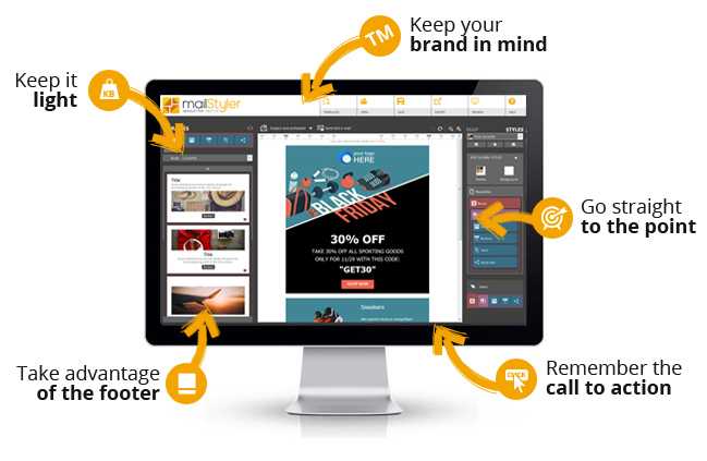
- Keep your brand in mind
MailStyler gives you the invaluable opportunity to build a truly customized template — not only fitting to your field of activity, but to your very brand. That’s why your newsletter design should be fully coherent to it: e.g. have your logo in the header, or recall your website’s look and style. - Keep it light
It’s very important for a newsletter to weight under 70-80 Kb, especially to simplify its delivery process. MailStyler’s elements layouts are designed to be the lightest, so you don’t have to worry about: just remember not to upload heavy images. - Go straight to the point
Our newsletter editing software gives you a huge choice in terms of design opportunity, so to let you fully unleash your creativity. But remember — a newsletter must first of all convey content, and be highly readable. So don’t exaggerate or overload your template with useless graphics: find the best balance for your needs and keep in mind that you have only a few seconds to entice your subscribers. - Remember the call to action
This is strictly connected to point 4. A (commercial) newsletter is by no means an end in itself: if you need to drive your users’ to subscribe, buy something or click on a link, then the “call to action” must stand out and catch one’s attention. That’s why MailStyler provides a series of digital buttons that you can easily customize (e.g. with a “Buy now” or “Subscribe” text) to emphasize the goal of your mailing. - Take advantage of the footer
Last but not least, always put a footer in your newsletter — with MailStyler it’s as easy as all the rest, you just need to drag and drop the element below the email body. Why? Because it’s the ideal place where to put your company details, the links to your Facebook, Twitter or LinkedIn pages and most of all the unsubscribe link.
DOWNLOAD DEMOBUY MAILSTYLER PRO
Latest release: 2.24.01.17 | Release date: 17/01/2024 | Size: 114.9 MB
License agreement | How to uninstall


